Empowering users to personalize playback through simplified equalizer controls
Empowering users to personalize playback through simplified equalizer controls
I created a simplified equalizer experience to boost engagement among Spotify Premium users, integrating intuitive pitch and speed controls while maintaining song integrity. This feature balanced creative freedom with ease of use, validated through real user testing and refined based on actionable insights to ensure both personalization and performance.
I created a simplified equalizer experience to boost engagement among Spotify Premium users, integrating intuitive pitch and speed controls while maintaining song integrity. This feature balanced creative freedom with ease of use, validated through real user testing and refined based on actionable insights to ensure both personalization and performance.

ROLE
ROLE
Product Designer
Product Designer
Client
Client
Personal Project
Personal Project
Industry
Industry
Entertainment
Entertainment
Duration
Duration
May 2024 - Jul 2024
May 2024 - Jul 2024
GOAL
GOAL
Empower listeners with deeper control over their music experience by enabling real-time customization of how songs sound, not what songs are recommended.
Empower listeners with deeper control over their music experience by enabling real-time customization of how songs sound, not what songs are recommended.
Spotify Syncro explores personalization beyond algorithms by giving users intuitive tools to adjust playback elements such as speed, pitch, and equalization without compromising the integrity of the original track. The goal was to reduce friction in advanced audio controls and help users actively shape their listening experience rather than passively consume it.
Spotify Syncro explores personalization beyond algorithms by giving users intuitive tools to adjust playback elements such as speed, pitch, and equalization without compromising the integrity of the original track. The goal was to reduce friction in advanced audio controls and help users actively shape their listening experience rather than passively consume it.
Why this works: This clearly distinguishes Syncro from recommendation systems and positions it as a control and creativity problem, not a discovery problem.
Why this works: This clearly distinguishes Syncro from recommendation systems and positions it as a control and creativity problem, not a discovery problem.
RESPONSIBILITIES
RESPONSIBILITIES
User Research, Concept Definition, Competitive Analysis, Interaction Design, Wireframing, High-Fidelity UI Design, Prototyping, Usability Testing, Design Rationale Documentation
User Research, Concept Definition, Competitive Analysis, Interaction Design, Wireframing, High-Fidelity UI Design, Prototyping, Usability Testing, Design Rationale Documentation
MY UX PROCESS
MY UX PROCESS

DISCOVERY
DISCOVERY
I noticed a recurring behavior on platforms like Instagram and TikTok users engaging with modified versions of songs. However, Spotify lacked a native feature to customize tracks based on mood. I identified a creative gap for music personalization
I noticed a recurring behavior on platforms like Instagram and TikTok users engaging with modified versions of songs. However, Spotify lacked a native feature to customize tracks based on mood. I identified a creative gap for music personalization
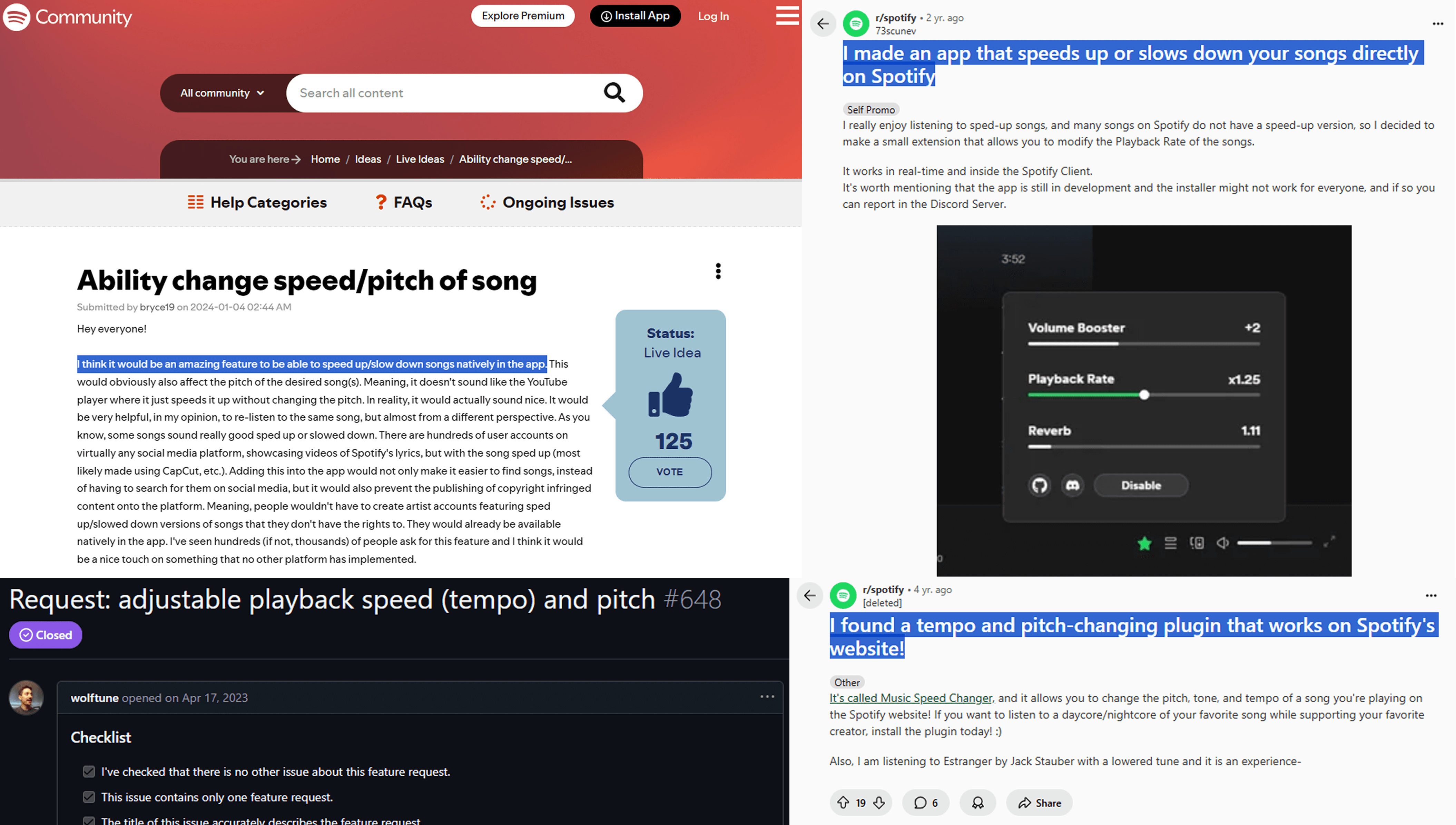
PROBLEM STATEMENT
PROBLEM STATEMENT
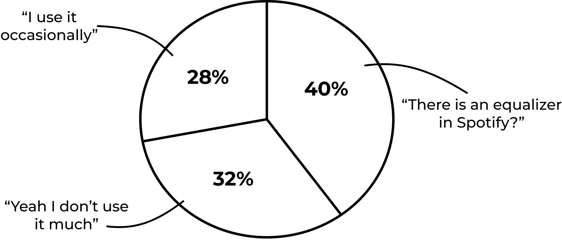
According to the discovery and the survey I conducted:
User awareness and engagement with Spotify's equalizer show a significant gap in usage and familiarity.
According to the discovery and the survey I conducted:
User awareness and engagement with Spotify's equalizer show a significant gap in usage and familiarity.
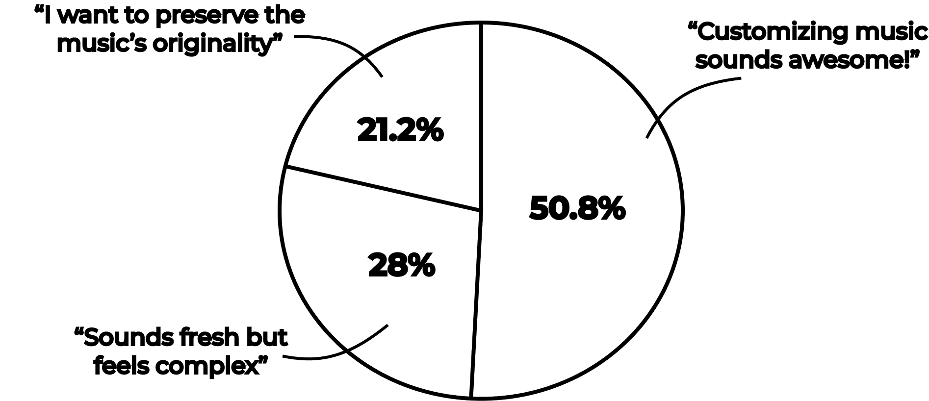
Users show excitement for music customization but express concerns about complexity and preserving originality of the Music.
Users show excitement for music customization but express concerns about complexity and preserving originality of the Music.
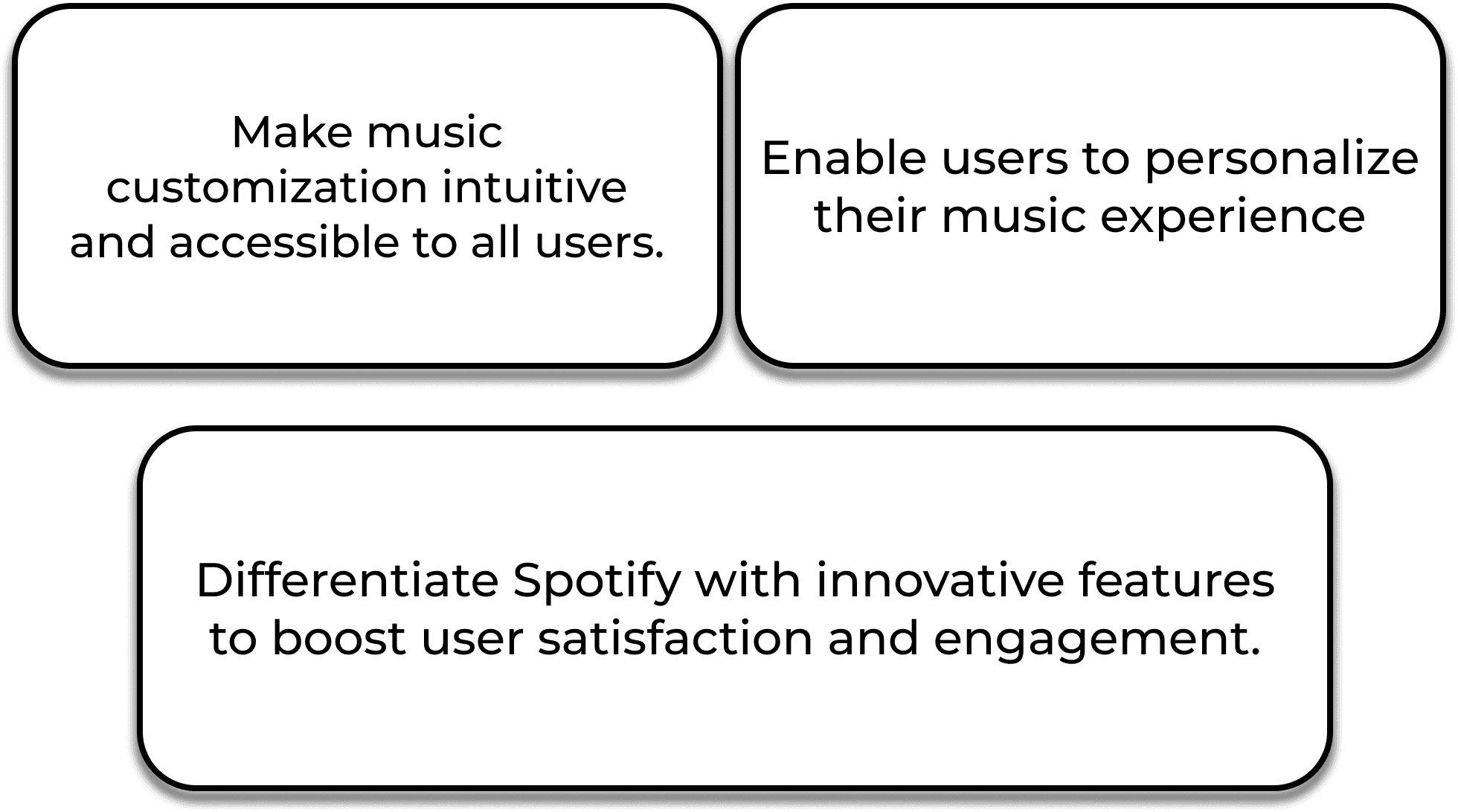
REQUIREMENTS
REQUIREMENTS
The Spotify experience has not been used to it's full potential, with many users wanting to engage with the equalizer but struggling to fully utilize it.
Now the real question is
"How can I help Spotify users create a more personalized and engaging music experience that feels worth the Premium cost and also utilizes the full potential of an equalizer?"
Based on the insights, I defined 3 key features: Mood sync slider, Save/Share remix, and Discover others’ edits. Each feature had clear user flows and acceptance criteria.
The Spotify experience has not been used to it's full potential, with many users wanting to engage with the equalizer but struggling to fully utilize it.
Now the real question is
"How can I help Spotify users create a more personalized and engaging music experience that feels worth the Premium cost and also utilizes the full potential of an equalizer?"
Based on the insights, I defined 3 key features:
Mood sync slider
Save/Share remix
Discover others’ edits.
Each feature had clear user flows and acceptance criteria.
TARGET AUDIENCES
TARGET AUDIENCES


USABILITY & USER FLOW
USABILITY & USER FLOW
Syncro caters to two types of users: those who want to personalize their music by adjusting beats and notes, and those who prefer curated, pre-customized tracks based on trends. Both scenarios offer an interactive, engaging listening experience.
Syncro caters to two types of users: those who want to personalize their music by adjusting beats and notes, and those who prefer curated, pre-customized tracks based on trends. Both scenarios offer an interactive, engaging listening experience.

DESIGN
DESIGN
Driven by user feedback and research, I designed Syncro to make each song a space for creative exploration. With features to adjust pitch, tempo, and more, Syncro empowers users to personalize their music experience through Creative and Altered modes, offering flexibility and control.
Driven by user feedback and research, I designed Syncro to make each song a space for creative exploration. With features to adjust pitch, tempo, and more, Syncro empowers users to personalize their music experience through Creative and Altered modes, offering flexibility and control.

Switch between modes:
Switch between modes:
A new toggle button has been added, allowing users to easily switch between Creative and Altered modes for a customized experience.
A new toggle button has been added, allowing users to easily switch between Creative and Altered modes for a customized experience.
The toggle that differentiates between the Creative mode and Altered mode is represented by a brush icon. This icon denotes the creative aspect of the design.
The modes are visually represented by this gradient involving green (Spotify's primary color) and black to add more visibility and texture to the design.

Creative Mode & Altered Mode:
Creative Mode & Altered Mode:
The goal of these modes are to provide users with a space where they can save & create customized songs. However, I aimed to ensure the default interface would be intuitive, preventing any confusion about the new UI. Therefore, I designed it based on the commonly understood concept of an equalizer at the time.
The goal of these modes are to provide users with a space where they can save & create customized songs. However, I aimed to ensure the default interface would be intuitive, preventing any confusion about the new UI. Therefore, I designed it based on the commonly understood concept of an equalizer at the time.
This brush with a plus icon saves the customization of the particular song. It expands into two options.
You can:
Save the song with that particular setting
Play all the songs on that specific setting.
This gives a sense of wide range of options for the user to choose from making it fruitful of their investment.

Access Customized Songs:
Access Customized Songs:
Once you save a customization for a song, it will be added to a separate playlist dedicated to your customized tracks. This playlist is independent of your other playlists and is specifically designed for your creative edits.
Once you save a customization for a song, it will be added to a separate playlist dedicated to your customized tracks. This playlist is independent of your other playlists and is specifically designed for your creative edits.
The customized songs are given a number as a depiction of the pitch the user has saved the song under. This avoids the confusion between the customized and non customized version of the song. The '-' before a number denotes that the song is the slowed version.Whereas a '+' denotes the song as a faster or sped up version of the original song.
The customized songs are given a number as a depiction of the pitch the user has saved the song under. This avoids the confusion between the customized and non customized version of the song. The '-' before a number denotes that the song is the slowed version.Whereas a '+' denotes the song as a faster or sped up version of the original song.
VALIDATIONS & IMPROVEMENTS
VALIDATIONS & IMPROVEMENTS
As drafted in the user flow, I started testing the prototype with my users and I got quite a few positive affirmation and helpful remarks on the design itself. Here are some common ones:
As drafted in the user flow, I started testing the prototype with my users and I got quite a few positive affirmation and helpful remarks on the design itself. Here are some common ones:

Initial version:
Initial Version
"I feel like the save customization button hinders the 'Add to playlist' button which I feel is more important here."
"I feel like the save customization button hinders the 'Add to playlist' button which I feel is more important here."

Final Version:
FINAL VERSION
"This makes much more sense and gives the button the justification."
"This makes much more sense and gives the button the justification."

Initial version:
Initial version:
Users didn't find this helpful as they had to hit save again for the same reason which lacks options in it.
Users didn't find this helpful as they had to hit save again for the same reason which lacks options in it.

Final Version:
Final Version:
Now users can have options to save their creativity without having second thoughts!
Now users can have options to save their creativity without having second thoughts!
TAKEAWAYS
TAKEAWAYS
Throughout the development of Syncro, I gained valuable insights into balancing creativity with usability, especially when integrating new features that users may not have explicitly requested. The iterative design process, with continuous user feedback, played a vital role in refining the experience to ensure it was both engaging and easy to use. Syncro offers more than meets the eye, as it aims to reshape the way users interact with music beyond just customization.
Timeline:
Completion (2 months):
Conducted user tests and gathered feedback on the prototype.
Refined the interface based on user insights, focusing on usability and aesthetics.
Launched the final version, ensuring all features functioned smoothly.
Future Plans:
Explore more customization options to enhance user creativity.
Simplify the user interface further for an even more intuitive experience.
Incorporate additional interactive elements based on user feedback.
If interested in the entire journey, feel free to access the Figma link provided to explore the process, iterations, and final designs in detail.
Empowering users to personalize playback through simplified equalizer controls
Empowering users to personalize playback through simplified equalizer controls
I created a simplified equalizer experience to boost engagement among Spotify Premium users, integrating intuitive pitch and speed controls while maintaining song integrity. This feature balanced creative freedom with ease of use, validated through real user testing and refined based on actionable insights to ensure both personalization and performance.
I created a simplified equalizer experience to boost engagement among Spotify Premium users, integrating intuitive pitch and speed controls while maintaining song integrity. This feature balanced creative freedom with ease of use, validated through real user testing and refined based on actionable insights to ensure both personalization and performance.
ROLE
ROLE
Product Designer
Product Designer
Client
Client
Personal Project
Personal Project
Industry
Industry
Entertainment
Entertainment
Duration
Duration
May 2024 - Jul 2024
May 2024 - Jul 2024
GOAL
GOAL
Empower listeners with deeper control over their music experience by enabling real-time customization of how songs sound, not what songs are recommended.
Empower listeners with deeper control over their music experience by enabling real-time customization of how songs sound, not what songs are recommended.
Spotify Syncro explores personalization beyond algorithms by giving users intuitive tools to adjust playback elements such as speed, pitch, and equalization without compromising the integrity of the original track. The goal was to reduce friction in advanced audio controls and help users actively shape their listening experience rather than passively consume it.
Spotify Syncro explores personalization beyond algorithms by giving users intuitive tools to adjust playback elements such as speed, pitch, and equalization without compromising the integrity of the original track. The goal was to reduce friction in advanced audio controls and help users actively shape their listening experience rather than passively consume it.
Why this works: This clearly distinguishes Syncro from recommendation systems and positions it as a control and creativity problem, not a discovery problem.
Why this works: This clearly distinguishes Syncro from recommendation systems and positions it as a control and creativity problem, not a discovery problem.
RESPONSIBILITIES
RESPONSIBILITIES
User Research, Concept Definition, Competitive Analysis, Interaction Design, Wireframing, High-Fidelity UI Design, Prototyping, Usability Testing, Design Rationale Documentation
User Research, Concept Definition, Competitive Analysis, Interaction Design, Wireframing, High-Fidelity UI Design, Prototyping, Usability Testing, Design Rationale Documentation
MY UX PROCESS
MY UX PROCESS
DISCOVERY
DISCOVERY
I noticed a recurring behavior on platforms like Instagram and TikTok users engaging with modified versions of songs. However, Spotify lacked a native feature to customize tracks based on mood. I identified a creative gap for music personalization
I noticed a recurring behavior on platforms like Instagram and TikTok users engaging with modified versions of songs. However, Spotify lacked a native feature to customize tracks based on mood. I identified a creative gap for music personalization
PROBLEM STATEMENT
PROBLEM STATEMENT
According to the discovery and the survey I conducted:
User awareness and engagement with Spotify's equalizer show a significant gap in usage and familiarity.
According to the discovery and the survey I conducted:
User awareness and engagement with Spotify's equalizer show a significant gap in usage and familiarity.
Users show excitement for music customization but express concerns about complexity and preserving originality of the Music.
Users show excitement for music customization but express concerns about complexity and preserving originality of the Music.
REQUIREMENTS
REQUIREMENTS
The Spotify experience has not been used to it's full potential, with many users wanting to engage with the equalizer but struggling to fully utilize it.
Now the real question is
"How can I help Spotify users create a more personalized and engaging music experience that feels worth the Premium cost and also utilizes the full potential of an equalizer?"
Based on the insights, I defined 3 key features: Mood sync slider, Save/Share remix, and Discover others’ edits. Each feature had clear user flows and acceptance criteria.
The Spotify experience has not been used to it's full potential, with many users wanting to engage with the equalizer but struggling to fully utilize it.
Now the real question is
"How can I help Spotify users create a more personalized and engaging music experience that feels worth the Premium cost and also utilizes the full potential of an equalizer?"
Based on the insights, I defined 3 key features:
Mood sync slider
Save/Share remix
Discover others’ edits.
Each feature had clear user flows and acceptance criteria.
TARGET AUDIENCES
TARGET AUDIENCES
USABILITY & USER FLOW
USABILITY & USER FLOW
Syncro caters to two types of users: those who want to personalize their music by adjusting beats and notes, and those who prefer curated, pre-customized tracks based on trends. Both scenarios offer an interactive, engaging listening experience.
Syncro caters to two types of users: those who want to personalize their music by adjusting beats and notes, and those who prefer curated, pre-customized tracks based on trends. Both scenarios offer an interactive, engaging listening experience.
DESIGN
DESIGN
Driven by user feedback and research, I designed Syncro to make each song a space for creative exploration. With features to adjust pitch, tempo, and more, Syncro empowers users to personalize their music experience through Creative and Altered modes, offering flexibility and control.
Driven by user feedback and research, I designed Syncro to make each song a space for creative exploration. With features to adjust pitch, tempo, and more, Syncro empowers users to personalize their music experience through Creative and Altered modes, offering flexibility and control.
Switch between modes:
Switch between modes:
A new toggle button has been added, allowing users to easily switch between Creative and Altered modes for a customized experience.
A new toggle button has been added, allowing users to easily switch between Creative and Altered modes for a customized experience.
The toggle that differentiates between the Creative mode and Altered mode is represented by a brush icon. This icon denotes the creative aspect of the design.
The modes are visually represented by this gradient involving green (Spotify's primary color) and black to add more visibility and texture to the design.
Creative Mode & Altered Mode:
Creative Mode & Altered Mode:
The goal of these modes are to provide users with a space where they can save & create customized songs. However, I aimed to ensure the default interface would be intuitive, preventing any confusion about the new UI. Therefore, I designed it based on the commonly understood concept of an equalizer at the time.
The goal of these modes are to provide users with a space where they can save & create customized songs. However, I aimed to ensure the default interface would be intuitive, preventing any confusion about the new UI. Therefore, I designed it based on the commonly understood concept of an equalizer at the time.
This brush with a plus icon saves the customization of the particular song. It expands into two options.
You can:
Save the song with that particular setting
Play all the songs on that specific setting.
This gives a sense of wide range of options for the user to choose from making it fruitful of their investment.
Access Customized Songs:
Access Customized Songs:
Once you save a customization for a song, it will be added to a separate playlist dedicated to your customized tracks. This playlist is independent of your other playlists and is specifically designed for your creative edits.
Once you save a customization for a song, it will be added to a separate playlist dedicated to your customized tracks. This playlist is independent of your other playlists and is specifically designed for your creative edits.
The customized songs are given a number as a depiction of the pitch the user has saved the song under. This avoids the confusion between the customized and non customized version of the song. The '-' before a number denotes that the song is the slowed version.Whereas a '+' denotes the song as a faster or sped up version of the original song.
The customized songs are given a number as a depiction of the pitch the user has saved the song under. This avoids the confusion between the customized and non customized version of the song. The '-' before a number denotes that the song is the slowed version.Whereas a '+' denotes the song as a faster or sped up version of the original song.
VALIDATIONS & IMPROVEMENTS
VALIDATIONS & IMPROVEMENTS
As drafted in the user flow, I started testing the prototype with my users and I got quite a few positive affirmation and helpful remarks on the design itself. Here are some common ones:
As drafted in the user flow, I started testing the prototype with my users and I got quite a few positive affirmation and helpful remarks on the design itself. Here are some common ones:
Initial version:
Initial Version
"I feel like the save customization button hinders the 'Add to playlist' button which I feel is more important here."
"I feel like the save customization button hinders the 'Add to playlist' button which I feel is more important here."
Final Version:
FINAL VERSION
"This makes much more sense and gives the button the justification."
"This makes much more sense and gives the button the justification."
Initial version:
Initial version:
Users didn't find this helpful as they had to hit save again for the same reason which lacks options in it.
Users didn't find this helpful as they had to hit save again for the same reason which lacks options in it.
Final Version:
Final Version:
Now users can have options to save their creativity without having second thoughts!
Now users can have options to save their creativity without having second thoughts!
TAKEAWAYS
TAKEAWAYS
Throughout the development of Syncro, I gained valuable insights into balancing creativity with usability, especially when integrating new features that users may not have explicitly requested. The iterative design process, with continuous user feedback, played a vital role in refining the experience to ensure it was both engaging and easy to use. Syncro offers more than meets the eye, as it aims to reshape the way users interact with music beyond just customization.
Timeline:
Completion (2 months):
Conducted user tests and gathered feedback on the prototype.
Refined the interface based on user insights, focusing on usability and aesthetics.
Launched the final version, ensuring all features functioned smoothly.
Future Plans:
Explore more customization options to enhance user creativity.
Simplify the user interface further for an even more intuitive experience.
Incorporate additional interactive elements based on user feedback.
If interested in the entire journey, feel free to access the Figma link provided to explore the process, iterations, and final designs in detail.
Empowering users to personalize playback through simplified equalizer controls
Empowering users to personalize playback through simplified equalizer controls
I created a simplified equalizer experience to boost engagement among Spotify Premium users, integrating intuitive pitch and speed controls while maintaining song integrity. This feature balanced creative freedom with ease of use, validated through real user testing and refined based on actionable insights to ensure both personalization and performance.
I created a simplified equalizer experience to boost engagement among Spotify Premium users, integrating intuitive pitch and speed controls while maintaining song integrity. This feature balanced creative freedom with ease of use, validated through real user testing and refined based on actionable insights to ensure both personalization and performance.
ROLE
ROLE
Product Designer
Product Designer
Client
Client
Personal Project
Personal Project
Industry
Industry
Entertainment
Entertainment
Duration
Duration
May 2024 - Jul 2024
May 2024 - Jul 2024
GOAL
GOAL
Empower listeners with deeper control over their music experience by enabling real-time customization of how songs sound, not what songs are recommended.
Empower listeners with deeper control over their music experience by enabling real-time customization of how songs sound, not what songs are recommended.
Spotify Syncro explores personalization beyond algorithms by giving users intuitive tools to adjust playback elements such as speed, pitch, and equalization without compromising the integrity of the original track. The goal was to reduce friction in advanced audio controls and help users actively shape their listening experience rather than passively consume it.
Spotify Syncro explores personalization beyond algorithms by giving users intuitive tools to adjust playback elements such as speed, pitch, and equalization without compromising the integrity of the original track. The goal was to reduce friction in advanced audio controls and help users actively shape their listening experience rather than passively consume it.
Why this works: This clearly distinguishes Syncro from recommendation systems and positions it as a control and creativity problem, not a discovery problem.
Why this works: This clearly distinguishes Syncro from recommendation systems and positions it as a control and creativity problem, not a discovery problem.
RESPONSIBILITIES
RESPONSIBILITIES
User Research, Concept Definition, Competitive Analysis, Interaction Design, Wireframing, High-Fidelity UI Design, Prototyping, Usability Testing, Design Rationale Documentation
User Research, Concept Definition, Competitive Analysis, Interaction Design, Wireframing, High-Fidelity UI Design, Prototyping, Usability Testing, Design Rationale Documentation
MY UX PROCESS
MY UX PROCESS
DISCOVERY
DISCOVERY
I noticed a recurring behavior on platforms like Instagram and TikTok users engaging with modified versions of songs. However, Spotify lacked a native feature to customize tracks based on mood. I identified a creative gap for music personalization
I noticed a recurring behavior on platforms like Instagram and TikTok users engaging with modified versions of songs. However, Spotify lacked a native feature to customize tracks based on mood. I identified a creative gap for music personalization
PROBLEM STATEMENT
PROBLEM STATEMENT
According to the discovery and the survey I conducted:
User awareness and engagement with Spotify's equalizer show a significant gap in usage and familiarity.
According to the discovery and the survey I conducted:
User awareness and engagement with Spotify's equalizer show a significant gap in usage and familiarity.
Users show excitement for music customization but express concerns about complexity and preserving originality of the Music.
Users show excitement for music customization but express concerns about complexity and preserving originality of the Music.
REQUIREMENTS
REQUIREMENTS
The Spotify experience has not been used to it's full potential, with many users wanting to engage with the equalizer but struggling to fully utilize it.
Now the real question is
"How can I help Spotify users create a more personalized and engaging music experience that feels worth the Premium cost and also utilizes the full potential of an equalizer?"
Based on the insights, I defined 3 key features: Mood sync slider, Save/Share remix, and Discover others’ edits. Each feature had clear user flows and acceptance criteria.
The Spotify experience has not been used to it's full potential, with many users wanting to engage with the equalizer but struggling to fully utilize it.
Now the real question is
"How can I help Spotify users create a more personalized and engaging music experience that feels worth the Premium cost and also utilizes the full potential of an equalizer?"
Based on the insights, I defined 3 key features:
Mood sync slider
Save/Share remix
Discover others’ edits.
Each feature had clear user flows and acceptance criteria.
TARGET AUDIENCES
TARGET AUDIENCES
USABILITY & USER FLOW
USABILITY & USER FLOW
Syncro caters to two types of users: those who want to personalize their music by adjusting beats and notes, and those who prefer curated, pre-customized tracks based on trends. Both scenarios offer an interactive, engaging listening experience.
Syncro caters to two types of users: those who want to personalize their music by adjusting beats and notes, and those who prefer curated, pre-customized tracks based on trends. Both scenarios offer an interactive, engaging listening experience.
DESIGN
DESIGN
Driven by user feedback and research, I designed Syncro to make each song a space for creative exploration. With features to adjust pitch, tempo, and more, Syncro empowers users to personalize their music experience through Creative and Altered modes, offering flexibility and control.
Driven by user feedback and research, I designed Syncro to make each song a space for creative exploration. With features to adjust pitch, tempo, and more, Syncro empowers users to personalize their music experience through Creative and Altered modes, offering flexibility and control.
Switch between modes:
Switch between modes:
A new toggle button has been added, allowing users to easily switch between Creative and Altered modes for a customized experience.
A new toggle button has been added, allowing users to easily switch between Creative and Altered modes for a customized experience.
The toggle that differentiates between the Creative mode and Altered mode is represented by a brush icon. This icon denotes the creative aspect of the design.
The modes are visually represented by this gradient involving green (Spotify's primary color) and black to add more visibility and texture to the design.
The toggle that differentiates between the Creative mode and Altered mode is represented by a brush icon. This icon denotes the creative aspect of the design.
The modes are visually represented by this gradient involving green (Spotify's primary color) and black to add more visibility and texture to the design.
Creative Mode & Altered Mode:
Creative Mode & Altered Mode:
The goal of these modes are to provide users with a space where they can save & create customized songs. However, I aimed to ensure the default interface would be intuitive, preventing any confusion about the new UI. Therefore, I designed it based on the commonly understood concept of an equalizer at the time.
The goal of these modes are to provide users with a space where they can save & create customized songs. However, I aimed to ensure the default interface would be intuitive, preventing any confusion about the new UI. Therefore, I designed it based on the commonly understood concept of an equalizer at the time.
This brush with a plus icon saves the customization of the particular song. It expands into two options.
You can:
Save the song with that particular setting
Play all the songs on that specific setting.
This gives a sense of wide range of options for the user to choose from making it fruitful of their investment.
This brush with a plus icon saves the customization of the particular song. It expands into two options.
You can:
Save the song with that particular setting
Play all the songs on that specific setting.
This gives a sense of wide range of options for the user to choose from making it fruitful of their investment.
Access Customized Songs:
Access Customized Songs:
Once you save a customization for a song, it will be added to a separate playlist dedicated to your customized tracks. This playlist is independent of your other playlists and is specifically designed for your creative edits.
Once you save a customization for a song, it will be added to a separate playlist dedicated to your customized tracks. This playlist is independent of your other playlists and is specifically designed for your creative edits.
The customized songs are given a number as a depiction of the pitch the user has saved the song under. This avoids the confusion between the customized and non customized version of the song. The '-' before a number denotes that the song is the slowed version.Whereas a '+' denotes the song as a faster or sped up version of the original song.
The customized songs are given a number as a depiction of the pitch the user has saved the song under. This avoids the confusion between the customized and non customized version of the song. The '-' before a number denotes that the song is the slowed version.Whereas a '+' denotes the song as a faster or sped up version of the original song.
VALIDATIONS & IMPROVEMENTS
VALIDATIONS & IMPROVEMENTS
As drafted in the user flow, I started testing the prototype with my users and I got quite a few positive affirmation and helpful remarks on the design itself. Here are some common ones:
As drafted in the user flow, I started testing the prototype with my users and I got quite a few positive affirmation and helpful remarks on the design itself. Here are some common ones:
Initial version:
Initial Version
"I feel like the save customization button hinders the 'Add to playlist' button which I feel is more important here."
"I feel like the save customization button hinders the 'Add to playlist' button which I feel is more important here."
Final Version:
FINAL VERSION
"This makes much more sense and gives the button the justification."
"This makes much more sense and gives the button the justification."
Initial version:
Initial version:
Users didn't find this helpful as they had to hit save again for the same reason which lacks options in it.
Users didn't find this helpful as they had to hit save again for the same reason which lacks options in it.
Final Version:
Final Version:
Now users can have options to save their creativity without having second thoughts!
Now users can have options to save their creativity without having second thoughts!
TAKEAWAYS
TAKEAWAYS
Throughout the development of Syncro, I gained valuable insights into balancing creativity with usability, especially when integrating new features that users may not have explicitly requested. The iterative design process, with continuous user feedback, played a vital role in refining the experience to ensure it was both engaging and easy to use. Syncro offers more than meets the eye, as it aims to reshape the way users interact with music beyond just customization.
Timeline:
Completion (2 months):
Conducted user tests and gathered feedback on the prototype.
Refined the interface based on user insights, focusing on usability and aesthetics.
Launched the final version, ensuring all features functioned smoothly.
Future Plans:
Explore more customization options to enhance user creativity.
Simplify the user interface further for an even more intuitive experience.
Incorporate additional interactive elements based on user feedback.
If interested in the entire journey, feel free to access the Figma link provided to explore the process, iterations, and final designs in detail.
Throughout the development of Syncro, I gained valuable insights into balancing creativity with usability, especially when integrating new features that users may not have explicitly requested. The iterative design process, with continuous user feedback, played a vital role in refining the experience to ensure it was both engaging and easy to use. Syncro offers more than meets the eye, as it aims to reshape the way users interact with music beyond just customization.
Timeline:
Completion (2 months):
Conducted user tests and gathered feedback on the prototype.
Refined the interface based on user insights, focusing on usability and aesthetics.
Launched the final version, ensuring all features functioned smoothly.
Future Plans:
Explore more customization options to enhance user creativity.
Simplify the user interface further for an even more intuitive experience.
Incorporate additional interactive elements based on user feedback.
If interested in the entire journey, feel free to access the Figma link provided to explore the process, iterations, and final designs in detail.